The trials of self replication
This was originally written on 17 July 2019.
I'm trying to calculate a spatially-weighted segregation statistic, one for which there's no canned routine. After fiddling with it in Python, I could output numbers rather than error messages. But were they good numbers? I paused to ensure that I could correctly implement the aspatial version of the statistic. I knew what its values should be, from a previous paper, so I could check my work against it.
Focus on the previous result for a moment. Consider this figure:

(From JP Ferguson & Rem Koning, “Firm Turnover and the Return of Racial Establishment Segregation,” American Sociological Review)
This is our estimate of racial employment segregation between US counties (in white), and racial employment segregation between workplaces within counties (in black). You want to keep the white separate from the black, and not because this is a study of segregation (hey-O); you don't want to confuse people's living in different labor markets with their working in different places within the same labor market. The former can still reflect segregation (see: spatial mismatch, sunset towns, Grand Apartheid, etc.), but of a qualitatively different type.
The decline and rise of the within component was the "A-ha" finding of that paper, and it's this that I set out to replicate with my shiny new code. The first attempt was not encouraging, though:

Hopefully the differences between the two graphs are obvious. I rolled my eyes, sighed, realized no one could observe me and that I was being melodramatic, and dug in. Per this blog's ostensible focus on process, I'll present my investigations in order rather than jumping straight to the answer.
Whence the differences? These new data are a strict subset of the old. Specifically, I calculated the new numbers on establishments that I successfully geocoded. Is there systematic bias in what was geocoded?
If you squint at the second figure, you'll see two weird spikes. The between component jumps up between 1985 and 1986, and the within component jumps up between 2006 and 2007. I've seen the jump in the within component before and know how to solve it; for now, focus on the between.
The government recorded three-digit ZIP codes in these data through 1985, switching to five-digit codes in 1986. That probably affected the match rate. I tabulated the accuracy rate for the two years before and after the change:
| year | total | accurate | accrate |
| 1984 | 141137 | 108939 | .771867 |
| 1985 | 140678 | 108642 | .772274 |
| 1986 | 146455 | 94903 | .648001 |
| 1987 | 148883 | 96409 | .647549 |
Weird. I thought the accuracy rate would have gone up? The match rate definitely did:
| year | match=0 | match=1 |
| 1984 | 3,529 2.50 | 137,608 97.50 |
| 1985 | 3,469 2.47 | 137,209 97.53 |
| 1986 | 199 0.14 | 146,256 99.86 |
| 1987 | 187 0.13 | 148,696 99.87 |
| Total | 7,384 1.28 | 569,769 98.72 |
But wait, how can the accuracy rate go down if the match rate goes up? I summarized the accuracy score reported back from the geocoding algorithm, by year:
| year | mean_acc |
| 1984 | .888 |
| 1985 | .888 |
| 1986 | .904 |
| 1987 | .904 |
Wait--this goes up, too? What the hell had I computed as the accuracy rate, then?
Going back through my code, I realized that I had calculated the "accuracy rate" as the proportion of geocoded observations where the reported accuracy was 1. And I'd kept only these. Yet those tables suggest that, while the average accuracy had gone up, the share of perfect accuracy had gone down. This is why the Good Lord gave us kernel densities:

With the three-digit ZIP codes before 1986, matching was basically an all-or-nothing proposition. From 1986, with the longer ZIP codes, more cases were matched, but more of the matches were good--i.e., 90%--but not perfect. By keeping just the observations with accuracy 1, I'd inadvertently thrown out a non-trivial number of the matched observations from the later years. I changed the code to keep if accuracy was .9 or greater starting in 1986.
The next step, just for sanity's sake, was to correct the post-2007 bump in the within component:

Better, though the level for the very early years still seems way too high. That might reflect which observations were being successfully geocoded in those early years. I know that the match rate is lowest in the early 1970s, so that seems likely.
I now wanted to see how the improved match rate after 1986 might have introduced bias. A crude way to do this is to look at how the distribution of missing, non-geocoded observations changed across different states. I calculated the share of non-geocoded observations by state, in 1985 and 1986; calculated the change in states' shares; squared that (to make outliers more obvious) and re-applied the sign of the change; and sorted the states by their signed squared change. That produced this graph:

This is telling. Before the change, California's establishments comprised a much higher share of the non-geocoded observations (hence the large negative change), followed by Florida's. Meanwhile, Illinois's establishments were a much lower share of the non-geocoded observations. This does not mean that fewer establishments were matched in Illinois in 1986 than in 1985; remember, the match rate goes up. Instead, far more establishments were added in California and FLorida than in Illinois.
This matters becuase the demographics of these states are very different. California and Florida had far more latino and Asian residents in 1985/1986 than Illinois did. Furthermore, some of the other "bulked-up" states include Arizona, New Jersey, and New York, all of which were comparatively ethnically diverse, while the other "slimmed-down" states alongside Illinois include West Virginia, Kentucky, and Washington. The change in how the government recorded ZIP codes in the mid-1980s changes the population of establishments in the dataset, increasing the relative size and diversity of some states and thus increasing the between-area segregation measure.
Two points are worth taking away from this. First, this implies that the jump after 1986 isn't the thing that needs explaining; the "drop" before 1986 is. And the explanation is sample-selection bias. This is good, because the later data are the more complete. I'd like them to be the less-biased! But my instinct was to assume that the earlier years were right and that something went wrong. I think this is a common way of reasoning, but it's also because the between component lies below the within component in the earlier years and in the first figure, and I was asssuming that was right. I'll come back to this.
Second, this isn't a "bump" that I can correct like the post-2007 one. The 2007 bump in was due to a one-time change that the government made to its data collection in 2007. That year, they made a special effort to survey firms that appeared in Dun & Bradstreet records and seemed like they should have filed an EEO-1 survey but had not. The survey responses that year included many new workplaces (the sample size jumps by nearly 2%), most relatively small, single-establishment firms with relatively high latino employment. That shift in the response population caused the 2006/2007 jump. But this particular effort didn't continue. The EEOC didn't continue to seek out such firms, and so over time, as the firms first surveyed in 2007 turned over, the respondent population converged back toward the pre-2007 type. That explains the sharp decline in the within component in the years after 2007.
To correct for this one-time shock, we removed the 2007 data from analyses, and we removed the firms that entered in 2007 from subsequent years' calculations. But we cannot do this with the 1985/1986 change. The shift from 3-digit to 5-digit ZIP codes was permanent, so the uptick in the between component just has to be treated like a permament shift. Fortunately we mostly care about trends, not levels!
So, I was almost there. But this is where the trials of self-replication really show up. You see, that first figure has an error in it! After we published the paper, Sean Reardon pointed out that we calculated the within component as a size-weighted sum of counties' between-establishment segregation measures, when instead we should have calculated it as the size-and diversity-weighted sum of same. We published a correction for this...
Tweeting about a recent publication corrigendum.https://t.co/j7MNkA12D6
— Rem Koning (@orgRem) May 15, 2019
I love seeing working papers and new pubs, but we all make mistakes.
In this case, after my paper w/ @jpferg came out in @asr_journal Sean Reardon pointed out that there was a mistake in our equations!
...and noted that, while the proper weighting did not change the broad shape of the within component, it did shift everything downward slightly. (This is because more diverse counties are somewhat less internally segregated. Giving those counties more weight lowers the within component, which is just a sum.) Voilà:
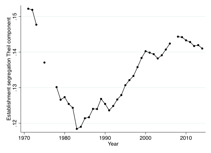
This is about the within component, though. The between component _is_ just a size-weighted sum, so it should not move when you make this correction. That implies that the between component has actually been larger than the within component almost this whole time! It's OK, we had no prior about this, and given that (e.g.) the between-industry component has always been bigger than the within-industry component of this measure, it isn't mind-blowing. But it does imply that when I rebuilt everything and got this:

...this is actually a faithful replication of the first figure, even though the two look different!
So what did I learn?
- Your goal shouldn't be simply to reproduce the published figures, even if they're your own. If there's a problem or error, with the published results, you need to replicate a fixed version.
- But you can't just call your slightly-different version fixed and move on. You also want to explain why there's a difference in the first place. In such instances, showing that you can replicate the published results by introducing the mistake into your code is a good way to convince yourself that you're on the right track.
- Replication is hard. Remember, these are my own data and code!
- I should have started with this, rather than going straight to the spatially weighted calculations (of which more later, probably). Now, if I modify the calculation and get different results, I have a lot more confidence that this reflects real differences, and not some problem with my replicaiton strategy.